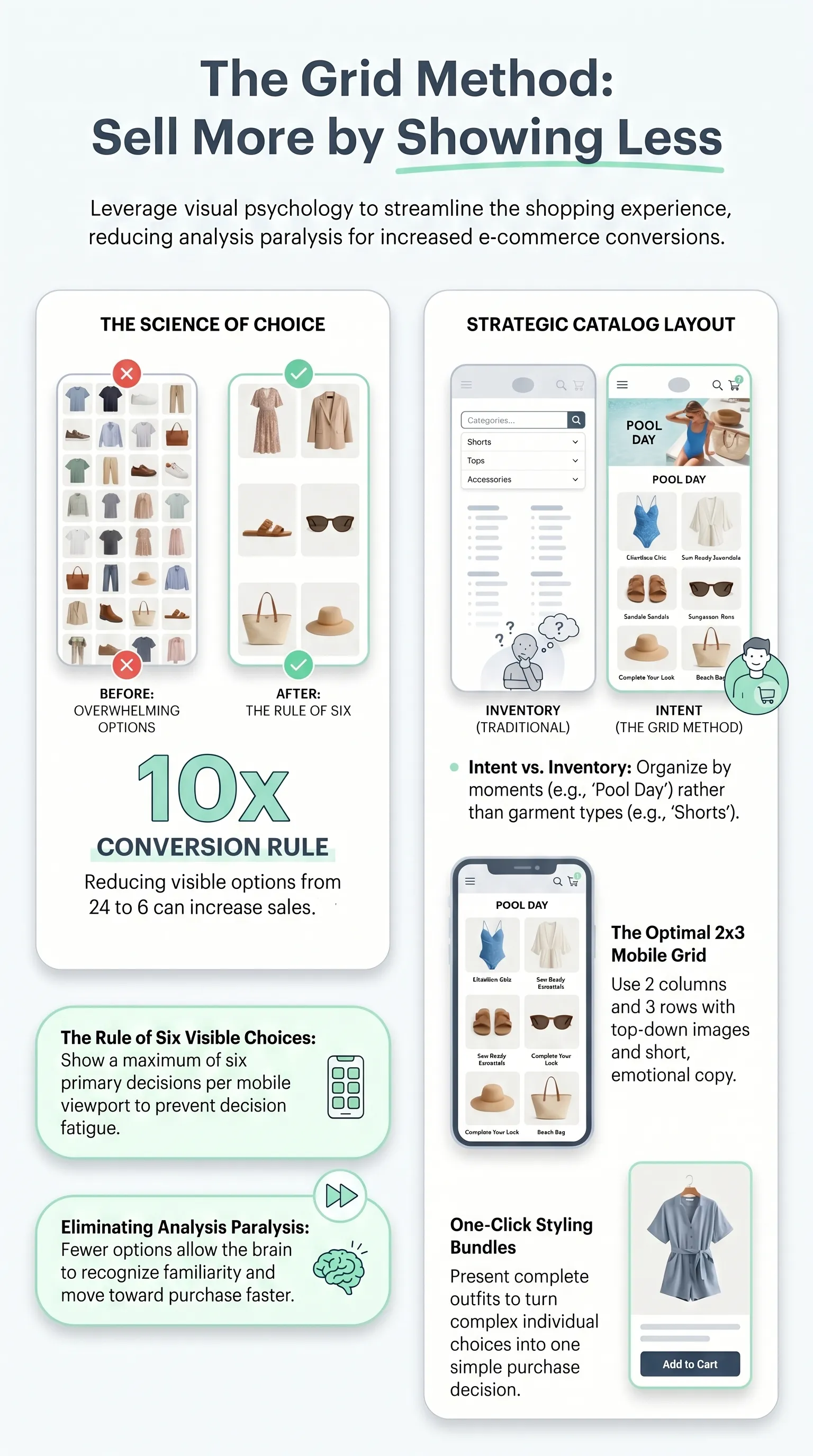
The Grid Method is a way to organize clothing variations in a grid layout, with up to six options per screen. It draws on neuroscience and emotional taxonomy, meaning the practice of grouping emotions into categories. That structure reduces the shopper's cognitive load and speeds up the choice.
The more a shopper has to compare, the harder it becomes to choose. The Grid Method steps in to cut that friction.
It tackles the Paradox of Choice: the more options shoppers see on one screen, the more they freeze. Instead of dumping every color, size, and style on the page at once, you break the display into visual groups that guide the person straight to a decision.
In 2026, three signals create instant trust for shoppers on their phones: an organized layout, Flat Lay photos, and clear bundles. The grid works like a built-in styling guide where each block says: this look is already ready for you.
The Grid Method: A Different Way to Sell
The Grid Method starts with a simple assumption: you sell more when shoppers see fewer options and understand them faster. It combines neuroscience, visual psychology, and screen-size awareness to build grids with up to six primary choices per view.
Each block in a clothing catalog includes an emotional title, such as "Romantic Party Look," a well-positioned image, and a clear bundle. The shopper's mental effort drops and the decision comes faster. The brain sees order, recognizes familiarity, and moves toward purchase without overthinking.
This setup works like a styling shortcut. Instead of making shoppers choose a shirt, pants, and accessories one by one, you show them the complete outfit in one click.
That kind of bundling turns multiple decisions into one. The chances of finishing the sale go up without overwhelming the customer.
Most online stores split their catalog by garment type: pants, shorts, shirts, blouses, underwear. The Grid Method prefers to organize by real-life moments such as Executive Workday, Night Party, Backyard Cookout, or Pool Day. The catalog connects with real shopping intent instead of only mirroring the inventory.
Each grid follows the Rule of Six Visible Choices and reinforces trust through consistent textures, soft shadows, and short captions. The shopper feels like they are looking at a storefront designed by someone who understands style and conversion.
The Rule of Six Visible Choices
Cutting options from 24 down to 6, for example, can increase conversion by up to 10 times, according to academic studies on the subject.
The Rule of Six Visible Choices applies that principle to mobile: in any viewport, meaning the visible part of the page on the screen, you show at most six primary decisions at a time.
That is why the ideal grid has 2 columns and 3 rows, with top-down images and short copy. If you have 12 color variations, split them across two screens or use themed tabs. Showing all 12 at once breaks the limit and stalls the decision.
In practice, each block in the grid highlights a subcollection: "Neutral Colors," "Bright Colors," "Party Looks." The shopper sees six aligned options and decides faster.
That limit reduces analysis paralysis and cuts down the Paradox of Choice. The brain does not have to compare 20 options at the same time to find the best one. The decision comes in seconds, shoppers feel more confident about buying, and abandonment drops.
Emotional Taxonomy vs. Inventory Logic
Most catalogs separate products by "blouses," "pants," and "dresses," right? That division helps operations, but it does not necessarily convert shoppers.
With Emotional Taxonomy, instead of showing "printed blouse," you show "Casual Date Look" or "Comfortable Weekend Outing." The shopper connects with emotions and use cases, not technical terms. A grid built that way helps close the sale faster.
That logic also makes it easier to group variations inside the same grid. Collections named by feeling, such as "Relaxed Weekend," give context right away. The shopper does not have to build combinations in their head.
Practical move: open your store catalog and create tags such as "Party Look," "Work Look," and "Travel Look." Link each tag to a 2×3 grid with ready-made bundles. Publish it and measure the results.
When you organize the catalog by occasion, shoppers tend to buy more than one item per order. The pieces in the look work together, and the average order value goes up.

Neural Fluency and Visual Trust Signals
Phone screens are still small compared with TVs and desktops, even on larger models. Mobile browsing has to feel smooth to make up for that.
The brain looks, scans, recognizes a pattern, and decides with little effort. That process is neural fluency.
For browsing to feel smooth, visual rhythm, typography, shadows, and color all need to work together. A grid with balanced blocks, steady lighting, and carefully measured negative space creates that feeling. The brain reads harmony, and the first emotional reaction is trust.
Three adjustments make that effect stronger:
- consistent textures, with the same light and shadow;
- micro-captions with a clear benefit, such as "date-ready set";
- bundling icons and "limited stock" badges.
When the Rule of Six Visible Choices meets those signals, an online catalog stops feeling scattered and starts telling a clear visual story. The shopper does not need to guess which piece goes with which. They see the complete look and trust it.
To keep that fluency across the whole catalog, add a short prompt in each block, such as "See the full look," and a trust badge such as "Stylist-approved combination." Those two details may look small, but they directly affect how quickly and confidently shoppers buy.
Practical Implementation of the Grid Method
You understand the theory. Now here are three steps to bring the Grid Method into your store.
Before building any grid, map your inventory: colors, sizes, styles, and occasions. Then define your emotional collections: "Romantic Party Look," "Relaxed Weekend," "Executive Workday." Think of each one as a mini collection with a clear purpose. Act like the stylist who designs the collection and the outfit combinations.
Once the map is ready, it is time to turn theory into practice.

Application Examples
Each collection becomes a clear set of outfit options. Three examples:
- Romantic Party Look: a grid with six dresses in shades of red and pink, each one paired with a full bundle, such as dress + purse + shoes. CTA: "Shop the romantic look," with a badge that says "Dinner-ready."
- Executive Ease Kit: blazer, silk blouse, and cigarette pants in color variations. Badge: "Stylist-approved combination," and micro-caption: "Ready for meetings."
- Relaxed Weekend Collection: Flat Lay photos with six variations across two screens, such as "Neutral Tones" and "Bright Tones." Each block gets a micro-caption like "Sunday brunch" or "Weekend trip," plus a CTA: "See the full look."
Benefits for the Shopper and the Seller
In the end, what matters is what both sides of the counter gain when you organize the catalog with the Grid Method.
For the shopper, the gain is clarity and confidence at the moment of choice. For the seller, it is the chance to attract more customers, close more orders, and grow profit.
When shoppers see at most six options per screen and read titles that connect with real-life use, the weight of choosing drops. The decision feels like something they can make in a few seconds.
The grid makes the catalog feel more organized and sends the message that the storefront was built with care. The shopper has fewer doubts and decides faster.
Complete sets sell more than individual pieces, so average order value rises.
And because the look is designed to work together, returns drop. Anyone who sees the full outfit before paying understands what they are about to get.
Neural fluency builds trust at first glance, and the combination of bundling plus micro-CTAs turns the click into action. The Grid Method does more than clean up the layout. It is a way to build trust into the way the catalog sells.

Conclusion
The Grid Method works when you organize the catalog with intention, not luck or gimmicks. The method combines emotional and operational design at the same time.
When you apply the Rule of Six Visible Choices, reorganize the catalog around Emotional Taxonomy, keep the visual flow smooth, and use visual bundling, your store becomes a guided shopping experience that respects how the shopper's brain decides. Mental effort drops and the decision comes faster.
Start by testing two or three emotional collections, then expand from there. Track three numbers: closed orders, items per order, and return requests.
When the visual experience builds trust, the shopper decides on the spot, and the Paradox of Choice stops holding your store back.
FAQ
How should I organize clothing by size to make shopping easier?
Take one photo in a medium size, keep the lighting and angle consistent, and generate variations with AI tools. Show S, M, and L together in a 2×3 grid, with short captions and trust badges. That visual consistency removes the random-photo feeling.
What is the best way to show product variations on mobile?
Use the Rule of Six Visible Choices: 2 columns and 3 rows per screen, with top-down photos and short text in each block. Split thematic variations into tabs such as "Neutrals" and "Brights." Comparison becomes quick, and the shopper decides in seconds.
What is the Grid Method for fashion retail?
It is a grid that combines the Rule of Six Visible Choices, Emotional Taxonomy, and bundling. Each grid shows up to six options with an emotional title, a top-down image, and a complete bundle. Multiple decisions turn into one guided choice.
How do I reduce clothing options to sell more?
Offer sets, such as a "full look" with one button, instead of selling shirt, pants, and accessories separately. Organize the storefront into emotional collections and show six options at a time. Decision friction drops and the value of each order goes up.
What is emotional taxonomy in an online store?
It means organizing products by occasion or feeling, such as "Executive Work Look" or "Relaxed Weekend," instead of technical stock categories. Each emotional collection becomes a grid with limited variations, which makes discovery easier and connects directly with shopper desire.
How does the Paradox of Choice affect an online store?
Too many options freeze the shopper. The Grid Method fights that by showing six decisions per screen and guiding the eye without extra mental effort. Less confusion, more purchases.